Blanchardstown Corporate Park

  • Branding
  • Brochure
  • Signage
  • Website

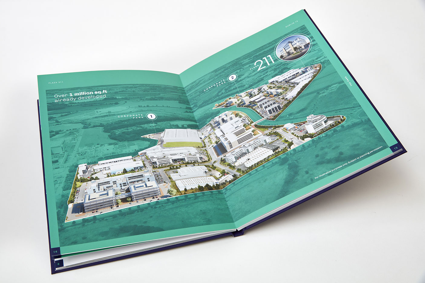
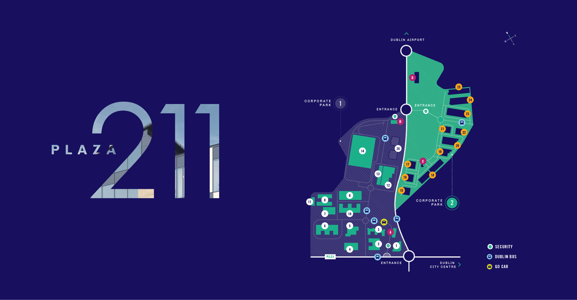
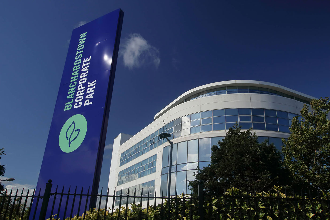
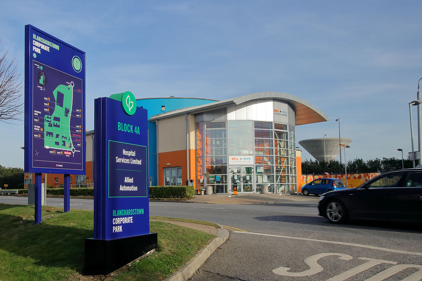
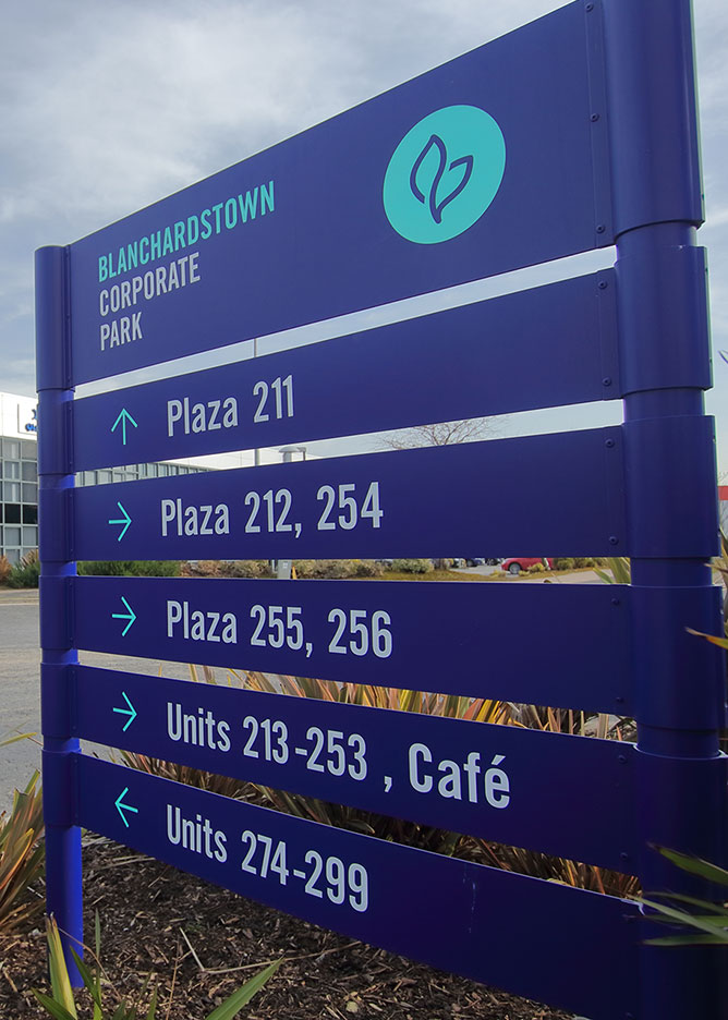
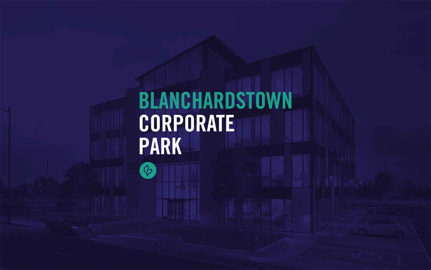
Blanchardstown Corporate Park has grown over the past two decades into a substantial business park housing a wide variety of companies and organisations.

The brand needed to have a strong and unique identity with a consistent visual language. We wanted it to demonstrate the high quality of its existing tenants, creating a strong and authentic personality that sets the park apart from the other business parks. We also needed it to reflect a friendly and personal environment, showing the happiness and wellbeing of the staff, as well as the family-business structure behind the management team.

The leaf icon forms part of the brand as a seperate graphic, making reference to the park’s green location, surrounded by trees. Trees may look the same, especially when they first begin - but they grow, thrive, change and, as they age, become very unique. It also reflects the core aspects of the brand, including family heritage, professional and economic growth, and high quality environment and landscaping. Additionally the icon consists of two interconnected leaves representing the two sides of The Park and the connection between landlord and tenant.
Primary Identity
Leaf Icon