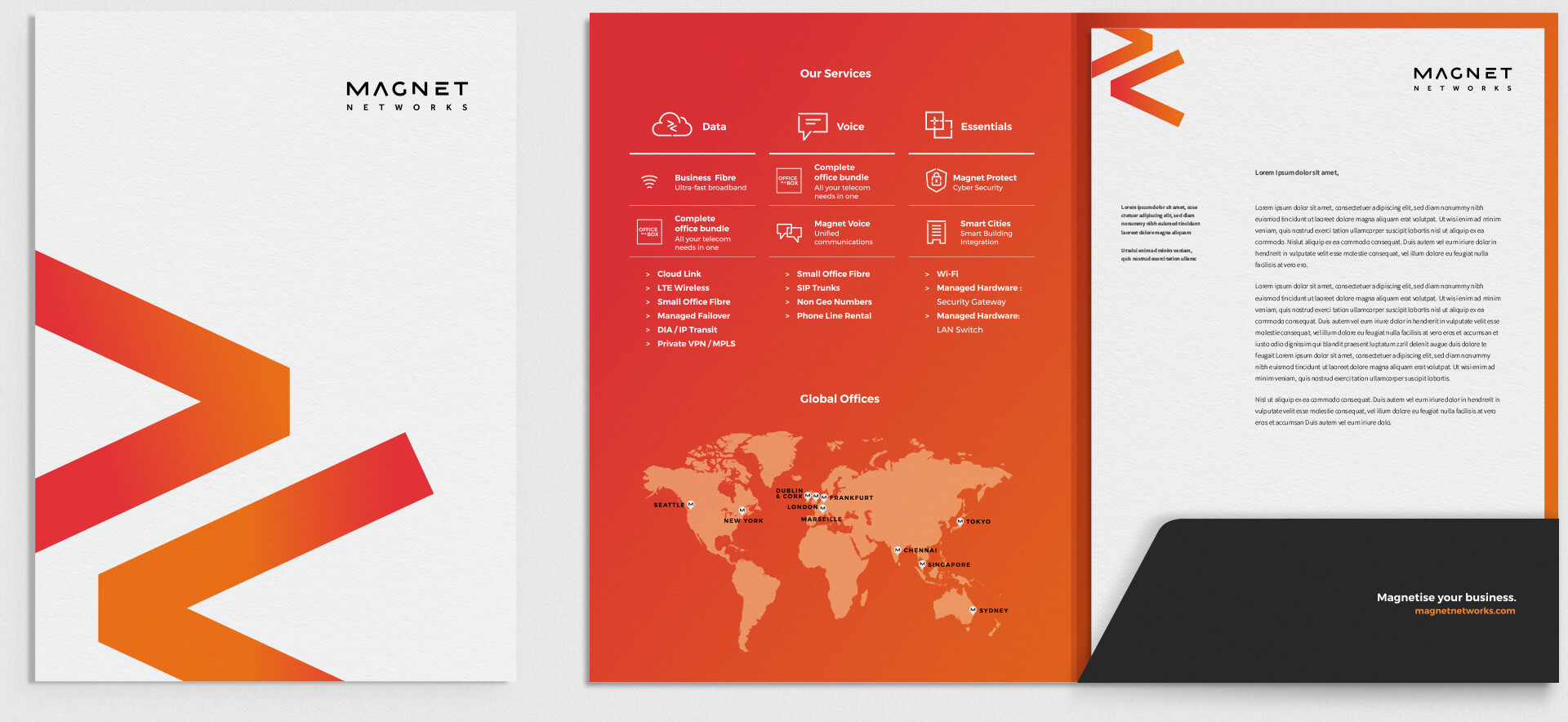
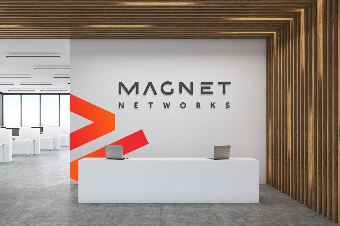
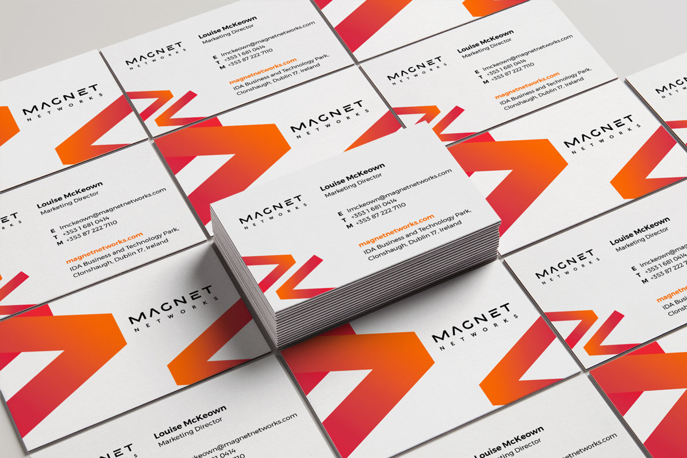
Magnet entrusted us with the task of revitalising their global identity, encompassing their logo, marketing materials, and website.
Our design approach was centered around crafting custom lettering to evoke a sense of dynamic motion. For brand continuity we extracted the arrow motif from the letter A in the logotype to use as part of the visual language. This motif served as a powerful element, resonating throughout the entirety of the brand rollout.


